Screens are the backbone of your app, defining its structure and user interface.
Each new screen becomes an opportunity to design unique user interfaces and interactions, tailoring your app to your specific needs.
Step 1: Add screen #
When you create a new application, a starting point is already set –
the first screen is automatically generated.
To expand your application’s functionality and structure,
simply click on the ➕ icon to add additional screens. 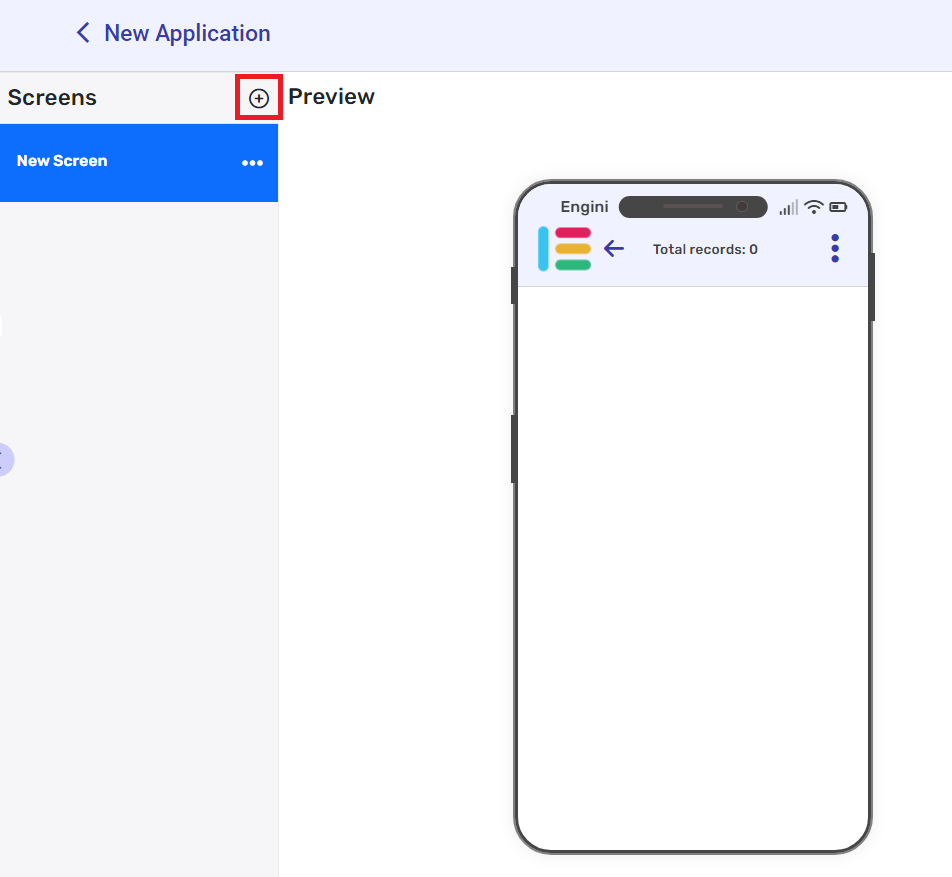
Duplicate Or delete a screen #
- Click on the three dots ••• on the right side of the Screen you want to duplicate/delete at the screens section.
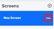
- Click on the action you wish to execute.
Move to App #
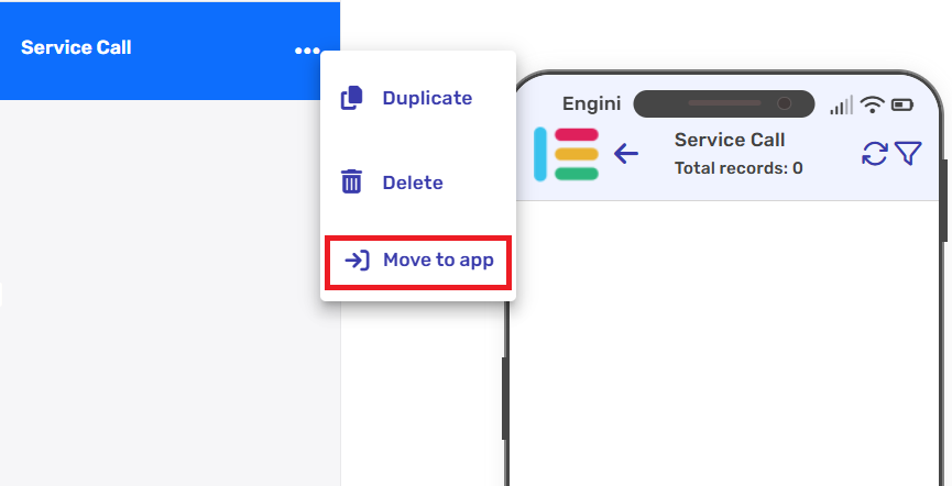
- Click on the three dots ••• on the right side of the screen you want to transfer at the screens section.
- Click on the ‘Move to app’.
Move to Top/Bottom #
The Move to Top/Bottom option lets you reorder fields, screens, and subscreens using arrow buttons that appear when hovering.
Where to use it:
- Fields: In the View Properties or Detailed View panel.
- Screens: In the Screens panel.
- Subscreens: In the Subscreens panel.
Steps:
1. Hover over a field in the View Properties or Detailed View or screen.
2. Two arrow buttons will appear on the right-hand side of the row or screen
- Click the up arrow to move it upward.
- Click the down arrow to move it down.
Refresh Screen #
The Refresh button lets you manually reload the current screen to display the most up-to-date data. Use it to ensure that any recent changes or updates are reflected immediately.
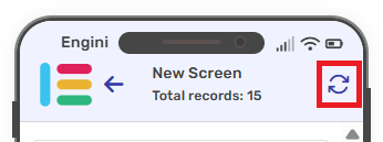
Steps:
1. Select your base table (the refresh icon appears after selecting a base table).
2. Tap the icon at the top right corner.
Step 2: Adjust properties #
The app creation board is located on the right side of the application. Through it, you can edit, modify, and configure your application’s screens and sub-screens.

Screen Properties #
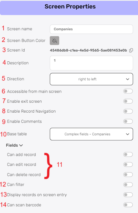
- Screen Name
The “Screen Name” field allows you to give your screen a clear and descriptive label. This name will be visible to users and help them understand the purpose of the screen at a glance. - Screen Button Color
The “Screen Button Color” defines the color of the button that appears in the menu for navigating to this screen. - Screen Id
“Screen ID” is a unique identifier automatically assigned to each screen. - Description
The “Description” field provides a context for the screen’s purpose.
A clear description helps in understanding and organizing your screens effectively. - Direction
“Direction” sets the layout orientation of your screen. Choose between options: left-to-right or right-to-left. - Accessible from Main Screen
The “Accessible from Main Screen” option allows direct access to this screen from the main application screen. When enabled, the screen is accessible from the main application screen. - Enable exit screen
The “Enable Exit Screen” option adds a button on the screen that allows the user to exit and return to the main menu. - Enable Record Navigation
When this option is enabled, navigation arrows will appear at the bottom of the detailed view screen, allowing you to quickly move between records without returning to the main screen.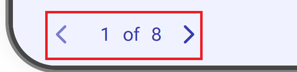
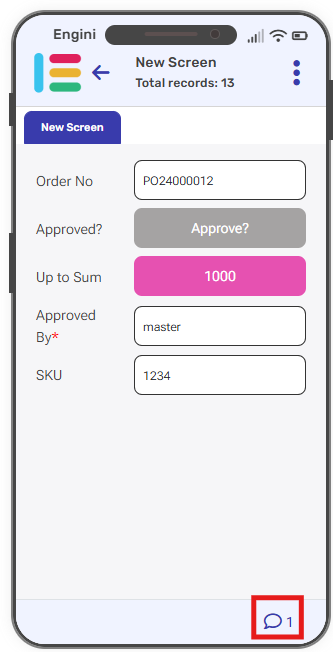
- Enable Comments
You can now add a comment directly in the table and see it reflected in the app. Additionally, you can also write a comment from within the app, and it will automatically be added to the underlying table the app is built on.
Click on Enable Comments to allow comments to be viewed on screens.
- Comments are Read only
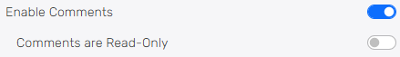
After enabling comments, you’ll see Comments are Read-Only.
Click on it to enable adding comments.- If you chose to click on it, you will see the comment icon on the right side of the record.
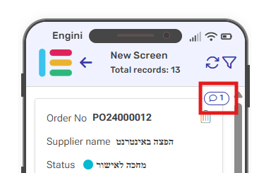
- Click on the field where the icon appears to view the comment and edit it.
- You now have the option to add a comment or reply to an existing one.
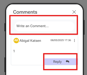
- New comment- Click on the empty field and write a new comment
- Reply to an existing comment- Click on Reply button and add your comment to an existing comment.
- If you chose to click on it, you will see the comment icon on the right side of the record.
- Comments are Read only
- Base Table
Selecting a “Base Table” lets you pick where your screen’s data comes from. It’s the main data that your screen shows and works with. Your app can get data directly from the Engini workbook’s tables. - Can add, edit and delete record
Control the ability to add, edit, and delete records from this screen. Toggle these options on or off based on the actions you want to allow users to perform. - Can Filter
Turn on “Can Filter” to help users easily find and explore data.
Important:
Search will query the result displayed on the screen while filter will perform a query against the table records and will refresh the screen to display the results. - Display records on screen entry
“Display records on screen entry” sets a predefined context for the screen by populating it with specific data upon opening. - Can scan barcode
Enable “can scan barcode” to seamlessly use barcode scanning in your app. When you turn on “can scan barcode”, you will see an additional field called “Autocomplete” which, when turned on, will enable automatic completion of the fields typed in the barcode field:- Barcode search definition:
- Choose from which table to look for the fields to complete.
- Select the field from which the values will be completed.
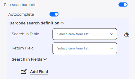
- Search in Fields:
- Click on “Add Field” button.
- Choose from the dropdown the field you want to search in.
- Return those steps for adding more fields.
- Barcode search definition:
You can find the complete guide for Workbooks in Workbooks category.
Important:
Without making this choice, certain crucial functionalities will remain out of reach. Make sure to pick your base table to unlock the full potential of your application.
Fields #
Fields are the building blocks of your screen, allowing you to collect, organize, and present data in a structured manner.
You have the flexibility to draw from the fields available in the chosen base table, ensuring seamless integration with existing data, or if your requirements extend beyond, you can effortlessly add new fields that capture the specifics of your data landscape. 
Base Table’s Fields #
After setting your base table, when you navigate to the ‘Fields’ section, by default, the fields from your selected table materialize before you.
Add Fields #
- Click on the “Add field” button and the tooltip will popup showing the field’s types you can use.
- Choose the field type you want to add from the following:
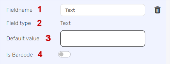
- Fieldname – Customize the name to describe the field’s purpose.
- Field type – Fixed as “text” for handling text data.
- Default value – Set a pre-filled value.
- Is Barcode (toggle) – Enable to use the field as a barcode scanner.
Button #
Allows you to create clickable buttons that users can interact with to perform specific actions or trigger events within your application.
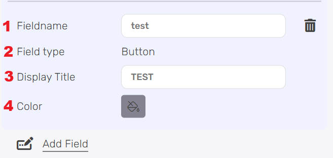
- Fieldname – Customize the name to describe the field’s purpose.
- Field type – Fixed as “button” for action buttons.
- Display Title – Enter the text you want to appear on the button. If left empty, the button will display the Field Name as its label.
- Color- Specify the color you want for the button.
Display a Button #
In order to display the button, follow the next steps:
1. Select the Detailed View option, within the View Properties.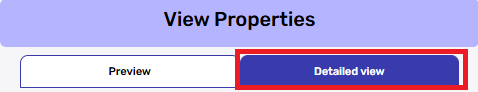
2. Scroll to find the Fieldname you just set up for your button, it will be under buttons title.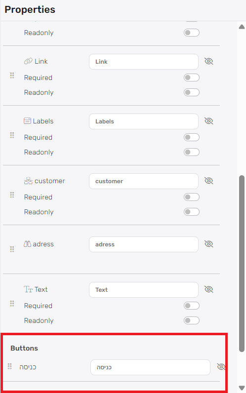
4. Click on the eye icon to make it visible in the app.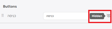
Now you can see the button in your app. 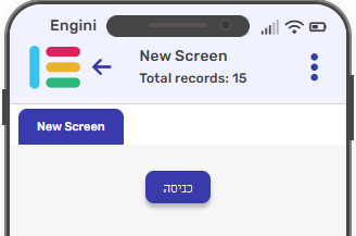
Checkbox #
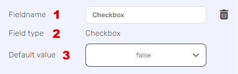
- Fieldname – Customize the name to describe the field’s purpose.
- Field type – Fixed as “Checkbox”.
- Default value – Choose from the dropdown options (True/False).
Date #

- Fieldname – Customize the name to describe the field’s purpose.
- Field type – Fixed as “date” for handling date and time data.
- Default value – Set an initial date value if needed.
- Format – Define the date format for display.
- Show time (toggle) – Enable to include time alongside the date.
- Time only (toggle) – Use this for a field that displays time only.
Integer & Number #
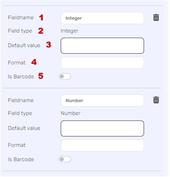
- Fieldname – Customize the name to describe the field’s purpose.
- Field type – Fixed as “integer” for whole numbers and “number” for decimal values.
- Default value – Set an initial numeric value if needed.
- Format – Specify the display format for numbers.
- Is Barcode – Enable to use the field as a barcode scanner.
Integration Dropdown & People & Status & Link & Labels #
Integration Dropdown -Allows users to select options from a dropdown menu linked to other systems or data sources.
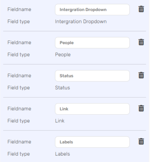
- Fieldname – Customize the name to reflect the field’s purpose.
- Field type – Fixed for each type, including Integration Dropdown, People, Status, Link and Labels fields.
For more information about the Fields types, go to Build a Table.
View Properties #
In this part, discover View Properties.
Each screen has 2 views: preview– list of records and detailed– specific record.
Preview #
“Preview” offers a window into your application’s user-facing side, letting you design data presentation.
Since “preview” presenting a record collection, you can also classify and filter data as needed.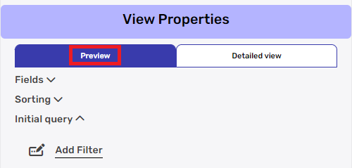
Fields:
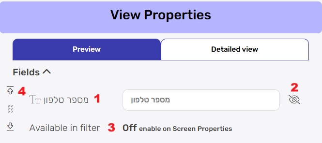
- Field name
Next to the field name in the table appears an editable field with the name of the field in the table by default. You can change the name of this field, so that a different name is displayed to the user than the name in the table. Please note that altering the field name within the application does not affect the field’s name in the database or the data table; it solely impacts the user interface context. - Eye icon
Adjacent to the Field name is an eye icon – clicking it toggles visibility of the field. This empowers you to decide whether users see the field or if it remains hidden. A crossed-out eye indicates the field is hidden from users. - Available in Filter
The “Available in Filter” option appears only after selecting “Can Filter” in the Screen Properties. By using this option, you can select which fields will be filterable on the screen.
When the filter button is clicked on the screen, you can see the fields you chose to filter.
Sorting #
Sorting lends order to your data. With the so you can establish how the view’s data is organized.

- Choose Field
- Decide the order in which data is presented.
Ascending showcases data in increasing order,
while descending displays it in decreasing order. - By click on the “Add field” label, you can add sort option.
Initial query #
By defining an “Initial Query,” you set the conditions for data inclusion. This ensures that when users open the view, they’re presented with data that’s contextually relevant from the get-go. 
- Choose a Field
- Choose a Condition
- Define the value: input the value that the selected field should match or meet based on the chosen condition.
- By click on the “Add filter” label, you can add more filters to further refine the initial data view.
Detailed View #
The “Detailed View” feature offers an extended interface within your application, strategically designed to provide additional information without overwhelming the user.
While “Detailed” focuses on a specific record, it doesn’t allow operations like classification and filtering.
When you click on the “Detailed View” tab, you gain access to all available fields, empowering you to make the following adjustments:
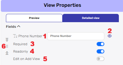
- Field name
Next to the field name in the table appears an editable field with the name of the field in the table by default. You can change the name of this field, so that a different name is displayed to the user than the name in the table. Please note that altering the field name within the application does not affect the field’s name in the database or the data table; it solely impacts the user interface context. - Eye icon
Adjacent to the Field name is an eye icon – clicking it toggles visibility of the field. This empowers you to decide whether users see the field or if it remains hidden. A crossed-out eye indicates the field is hidden from users. - Required
Toggle “Required” to indicate whether the field must be filled out by users. When turned on, users won’t be able to add, edit, delet and search a record without providing the necessary information. - Read only
By activating “Readonly,” you ensure that users can only view the data and not modify it. This is particularly useful for displaying data that shouldn’t be altered. When Read only is enabled, the “Edit on Add View” option becomes available. - Edit on Add View
This feature allows you to populate read-only fields only during initial record creation. Once the record is saved, these fields become permanently read-only, meaning they can no longer be changed. - Move to Top/Bottom
The Move to Top/Bottom option appears when you hover over a specific field row Two arrow buttons will appear on the left side of the field.
You can change the order of the screens in the screen section.
Sub Screens #
Sub screens let you connect screens within your app smoothly. This means you can easily add one screen inside another, making a connected user experience. 
Choose Sub Screen #
- Screen
Choose the Screen you want to use as a sub screen. - Display Order
“Display Order” determines the sequence in which Sub Screens appear within the main screen. By assigning a numerical value, you orchestrate the order of presentation, ensuring a structured and intuitive navigation flow. - Display in Main Form
When you turn on “Display in Main Form”, your Sub Screen seamlessly integrates into the main screen’s layout. Users can access the Sub Screen’s content without needing to navigate away from the main context.
Use Conditions #
Using conditions on Subscreen fields is like making a smart cut in a puzzle. You decide what pieces to show based on certain rules, creating a clear and focused view for users. 
- Choose a Field
- Choose a Condition
- Define the value: input the value that the selected field should match or meet based on the chosen condition.
- By click on the “Add Condition” lable, you can add more conditions to further refine the initial data view.
Default values #
Setting a default value for Sub Screen fields, ensures that the field in the Sub screen already has a value from the parent screen, maintaining the cut we’ve defined when use conditions.
- Choose Field
- Set value expression.
Dynamic Connect Table in Your App #
A dynamic connect table is used to create smart links between different tables in Engini. What makes it “dynamic” is that it automatically shows only the relevant options based on the current record you’re working with.
Instead of showing all possible values from a connected table, it filters the options using a unique identifier (like an ID or code). This means users only see the choices that actually apply to the current record, making it easier to select the right one and reducing errors.
First define your tables in Engini Tables.
Connected Tables in Engini Tables #
In this example, you can see how the connected tables work in practice:
- Sales Process Table: Contains detailed process information where “Process Number” serves as the linking field (1, 2).
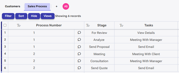
- Customers Table: Contains customer records where the “Sales Process” field holds values (1, 2) that correspond to process numbers.
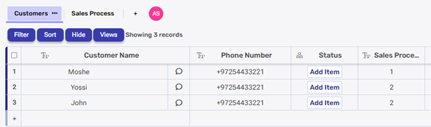
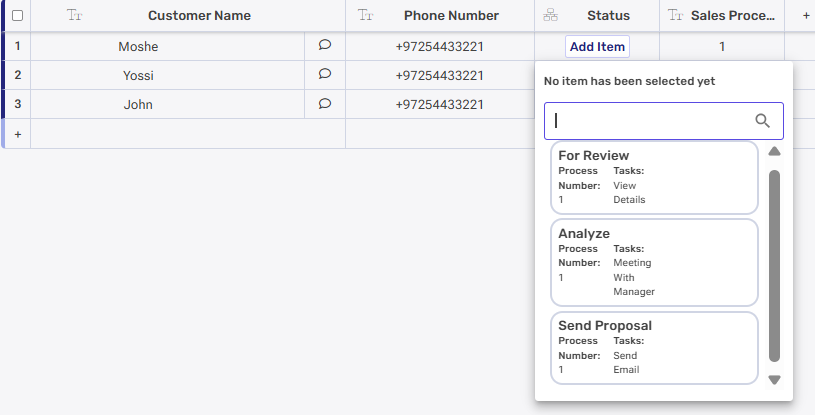
When a customer record has “Sales Process = 1”, it automatically connects to all the stages in the Sales Process table where “Process Number = 1”. For example, if the customer Moshe has Sales Process 1, then Moshe will be linked to all the stages under Process 1, like “For Review”, “Analyze”, and “Send Proposal”. This setup ensures that Moshe only sees the stages that are part of Sales Process 1, not stages from other processes.
How we define it in the tables? we use filters, click here to learn about it.
This relationship allows Engini app to display relevant process information and tasks for each customer based on their assigned sales process number.
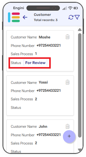
When connecting the tables to your app you will see in your home page the following information about the customers from the base table:
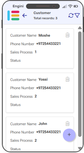
- Each customer record displays customer’s basic information (Customer Name, Phone Number, Sales Process number) alongside dynamic field for Status. The Status field initially appear empty but are automatically populated with relevant data from the connected Sales Process table based on the customer’s assigned process number.
- When clicking on a specific customer, you are navigated to his detailed view.
- On this screen, you can edit and add customer information. You can also update dynamic values that are linked to the Status field, which are populated based on data from the connected table.
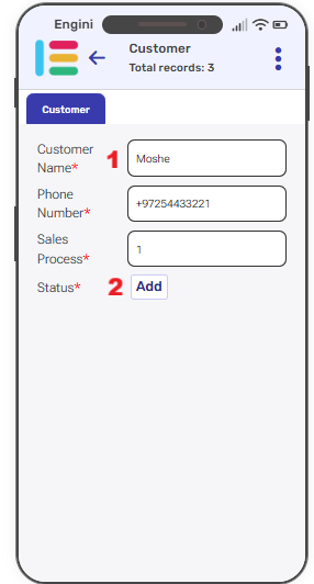
- Static fields: Basic data entry fields (text, numbers, dates) that store information directly in the base table.
- Dynamic fields: Connected table fields pull values from related connect tables and update automatically based on record relationships. They let you choose from the available options in the linked table.
Clicking a dynamic field (such as the Status field) opens a selection screen with options from connected tables. Because each customer is linked to a specific sales process, only the stages for that process are shown. For example, a customer with Sales Process 1 will see only the stages associated with that process.
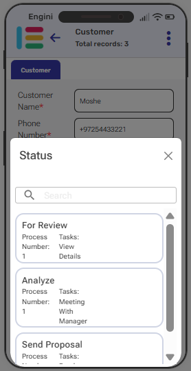
For single-select columns (like Status), only one option can be chosen at a time.
As you can see, after updating the record, the home screen will display the selected value, in this example, “For review.”
Business Rules #
As we finish looking at Screen Properties, we step into Business Rules.
To learn more about using Business Rules as part of your app, check out the link.


.png)